“The Chameleon”
When you imagine a trip to Bali, you may think first of lying on white sand beaches in the shade of tall palms. But a bit away from the water is where the magic can really happen. The jungles of Bali are rich with greenery and wildlife — and if you’re lucky enough, you may even find yourself at one of the island’s most luxurious estates, nestled right into that jungle. The home featured here is just such a retreat. Featuring a sparkling clear infinity pool, an outdoor bath, and plenty of indoor space for the long and luxurious evening of a vacation, this home is a true treasure, as you’ll see in the photos from photographer Daniel Koh.


The Makeover…It’s Personal – The Master Bedroom with Walk-in Closet and Ensuite Bath
The demolition and construction started in our service kitchen that will house our future Master’s Bedroom.
Since the whole house will apparently be uncomfortable to live, we decided to prioritize the bedroom as originally planned and suggested to the architect. This will be the Phase 1. The room will accommodate my whole family during the renovation period.
We wanted the same requirements as in our previous one, but we wanted it to have a high ceiling, bigger space with the open shelves walk-in closet and ensuite T&B as usual. The architect suggested making a customized king size bed frame with headboard, including the side tables.


This room has been our common bedroom, our refuge from all dust and mess from outside and temporary storage. It was definitely an unwelcoming idea for my wife, but does she have any choice? Even if it was not yet ready for the installation of the air-conditioning unit, it was immediately installed.
The Makeover…It’s Personal – Moving Forward 1 (Roof and Programme)
The weather in the Philippines was very unpredictable and it was crucial to complete the roof once and for all. I was on Christmas holiday when we started working on it. Some change in plan was consider like including covering the slab above the garage to provide a den, an extra room for guest, a TV room or study room as our previous one will be used as bedroom for one of the boys. I left the country without finishing the work. Eventually, a roof over my family’s head were screwed and riveted in place.


Since my family lived in here during the whole duration of construction, the architect came up with programme, doing the whole house in four (4) phases. He prepared plan for each phase starting with the master bedroom with walk-in closet and ensuite bath (Ph1 – The Masters); the laundry, service kitchen, maid’s quarter with T&B, formal kitchen, dining and common T&B for the kids (Ph2 – The Service Area); the living room and the courtyard/airwell (Ph3 – The Front Room) and the kid’s rooms and the den (Ph4 – For the kids). We did not include works in the facade (The Envelope) and the apartment at the back (For Rent – Back of the House).
(To be continued…)
The Makeover…It’s Personal.
The House has gone through a number of extensions, renovations and repairs. From a humble 25 square meters house on 69 square meters lot to about 700 (including a proposed 5-doors apartments at the back), can you imagine how many has been done through all these years?
With the generous help and support of Arch. Butch who provide an almost free assistance, we finally came up with plan to do what I can say “the realization of our dream”. We were so scared as we know our budget seems not enough to start the project.
It was sometime October 2016, when we had the discussion and came up with the plan to have the renovation. We just wanted to re-roof and improve the facade that would make all previous extensions looks like it was done at one time.
The sketches were drawn and shown to us by the architect.


November 2016 from these initial concepts, it started to snowballed into Olympic scale. These drawing started to take its form as Juni, my well-trusted contractor, started to demolish, break, and rebuilt. Deliveries of materials started to filed up our space and the first hollow block has been set.


What makes us finally decide to have this major decision of rebuilding our house? It’s the leak. This bungalow was actually designed and proposed for another storey in the future. So, obviously all the extension has been covered with a slab roof that would serve later as the flooring for the next phase. Unfortunately, budget did not allow me to push with the rest of my plan yet and it’s a fact that a slab is not a wise idea as a shelter from rain. The leaked damage our ceiling and other stuffs below it. We have to bear that for several years, whilst spending money for repairing and repainting till the next rainy season, again and again.
Hence, we came up with the solution, to cover the roof of the whole house and forgo the idea of the having another floor.
From paper…


To the real thing (with long time business partners, Edgar for the trusses and Apollo for roofing installation). The roof was a combination of Banawe and Multirib from Puyat Steel (0.50mm).


(To be continued…)
The 100-Square-Foot Kitchen: A Dark Space Sees the Light
Our 100-Square-Foot Kitchen series profiles kitchens that measure about 100 square feet, one of the most common kitchen sizes in the U.S., according to Houzz data.
Architect Lauren Rubin says the original cramped kitchen in this pre-World War II apartment in New York was so sad-looking that anything she did to it would have made it better. Still, that didn’t keep her from making sure the new design received lots of love and attention. She took square footage from a nearby dining nook to slightly expand the room, freeing up space to create an L-shaped layout and recess a new refrigerator. Next, she employed design tricks she’s learned working in small New York City spaces to visually expand the room and give it a feeling of lightness.
Kitchen at a Glance
Location: Hudson Heights neighborhood of New York City
Who lives here: A family of four
Size: About 72 square feet (6.5 square meters); 10 feet 10 inches by 6 feet 8 inches (new kitchen)
Designer: Lauren Rubin Architecture
BEFORE: The existing galley layout lacked counter space, storage, adequate lighting and style. Rubin removed the arch and half wall to encroach several feet into the dining area, seen in the foreground. This still left the homeowners plenty of room for their dining table.
AFTER: Adding length to the space allowed Rubin to remove cabinets to create an L-shaped layout with more counter space and a wider middle walkway. Extending the kitchen into the dining area allowed Rubin to add the recessed fridge on the right and a cabinet with a countertop and microwave drawer to the left of the range.
Standard upper cabinets typically hang 18 inches above a counter. Rubin chose to hang these 22 inches up to create more openness. “I find for small kitchens hanging cabinets 18 inches above a countertop makes things feel small and congested,” she says. “You lose some storage, but it’s important to make those small spaces feel as light and airy as possible.”
Rubin and the homeowners splurged on the custom cabinets, which Rubin designed and had a woodworker build, as she does for most kitchens. “Pre-manufactured cabinets, you’re stuck with their dimensions,” she says. “Here, every inch is taken into account. There are no filler panels.”
Customizable inserts maximize storage in every drawer and cabinet. Pullouts beneath the sink hold garbage and recycling bins. The microwave drawer helps keep the counter clear. “Most clients would rather lose a drawer than have a microwave on the counter or hanging below a cabinet,” she says.
A new pantry around the corner from the refrigerator stores food and small appliances, such as a toaster oven and juicer.
Custom open shelves provide space to charge phones, store spices and cups and display art and plants. Rubin had the woodworker who built the cabinets create the sets of white and gray floating shelves. “That way they match perfectly,” she says. “Everything happens in the same shop with the same can of paint.”
Taking the tile to the ceiling gives a sense of brightness and height, despite the fact that the ceiling was dropped slightly to accommodate new recessed LED lights. “Good, even light in a kitchen is worth dropping the ceiling versus keeping it high and having just a light fixture,” Rubin says.
To enhance the light further, she chose the whitest countertop she could find. She went with engineered quartz for its even color and durability. “For anyone who’s a cook or wine drinker I won’t put marble down,” she says. Some homeowners find marble counters difficult to keep free of stains and other damage.
Next to the sink, the paneling that covers the dishwasher prevents too much stainless steel from breaking up the flow of the lower cabinets.
Stained oak floors replaced the checkered vinyl, and they match the floors in the adjacent dining and living spaces, creating cohesiveness.
Lower cabinet paint: Worsted, Farrow & Ball; upper cabinet paint: Chantilly Lace, Benjamin Moore; ceiling paint: Super White, matte finish, Benjamin Moore; wall paint: Wimborne White, Farrow & Ball; lights: Contrast Lighting; microwave: Sharp; range: Wolf; hardware: Richard Watson
Looking toward the kitchen from the living room, you can see the double-door pantry around the corner from the refrigerator and get a sense of the more open interaction with the dining and living spaces. “It’s a compact kitchen, but you never feel that way,” Rubin says.
5 Clever Small Loft Ideas


Crunched for space, the residents of these homes—mostly under 1,000 square feet—have the same ideas: look upward and compartmentalize. Lofted sleeping areas, closets, and reading nooks are among the smart space-saving solutions.
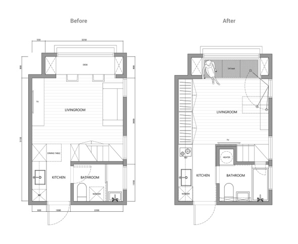
Super Tiny Home Design Under 30 Square Meters (Includes Floor Plans)
This beautiful apartment may be on the smaller side, but the layouts are super smart! This clocks in at less than 40 square meters of floor space, yet it make the most of the compact layouts by striking the perfect balance between openness and functionality. And get ready to redefine your loft goals: this apartment features lofted bedroom and office, clearing out plenty of space for other lifestyle necessities.
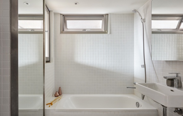
Simple tiles and simple fixtures allow the bathroom to feel open and comfortable, while at the same time, carefully curated decoration avoids an overly utilitarian aesthetic.

Occupying the space below the mezzanine level, the bathroom is surprisingly bright and spacious with plenty of natural sunlight throughout – with a large vanity mirror to maximize its effect.
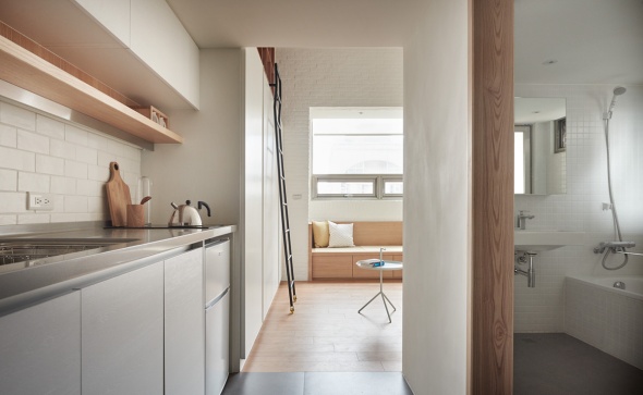
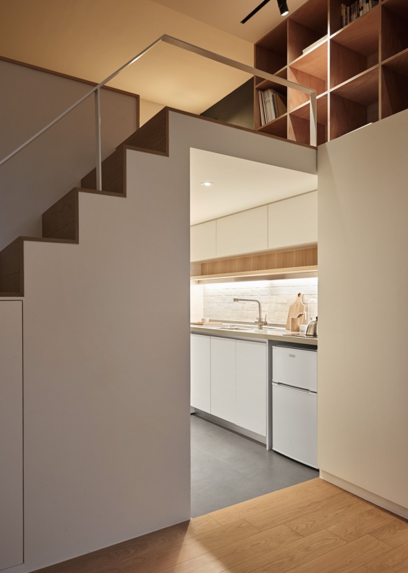
Guests and residents enter the apartment through the kitchen, the bathroom conveniently through the door to the right hand side. This sensible layout maximizes the amount of sunlight in a space that would be fairly dark otherwise.
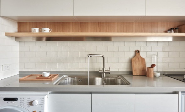
Open wood shelving allows for display of attractive coordinated utensils and tableware while deep cabinets hide everything else above and below.

Appliances take a conservative approach by remaining mostly below the countertops. The washer and dryer used to reside in the bathroom but once you see the bathroom’s fresh new style, you’ll see why the designer moved them.
Limited in terms of vertical space and natural lighting, the kitchen makes the best of its circumstance with bright white surfaces and smooth concrete floors.
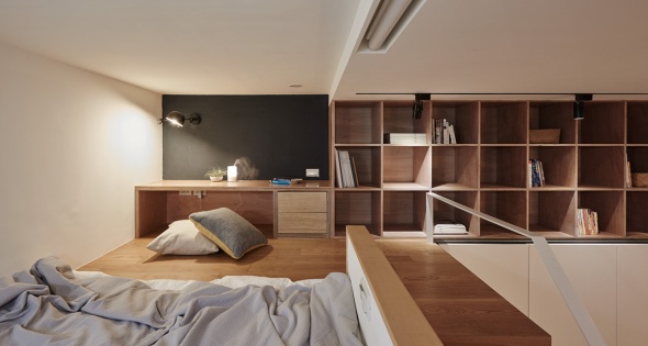
The ceilings aren’t especially high so the loft keeps furniture very low to the floor. Pillows make it easier to sit cross-legged at the desk for longer stretches of time.

From the bedroom, it’s easy to catch a glimpse of the neighboring apartment building or admire the living space below. A half-wall offers just enough privacy to help the resident feel secure.

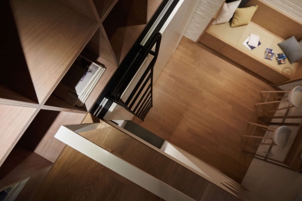
Compact stairs lead to the bedroom loft with kitchen and bathroom beneath. Note that the designer didn’t pass up a chance to integrate more storage space under the first few steps. Smart!
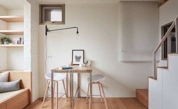
Split construction gives the dining table more functionality for its footprint. This configuration maintains a streamlined form against the wall, appropriate for working on a laptop or sitting down to write a letter.

Because of the resident’s frequent travel, the books don’t require constant access. The sliding ladder makes them easily available when needed with several shelves within easy access of the loft.

Furniture remains as simple as can be. Each piece scales to its specific niche without flaw, the tatami sofa tucked into the window alcove and the dining table matching the width of the alcove’s edge.

Located in Taipei, Taiwan, this apartment simplifies its interior to the most basic elements in order to stretch its 22 square meter layout. The ceilings reach 3.3 meters in height – somewhat low compared to other interiors with mezzanine levels but more than enough for this designer to work with. The resident (a frequent traveler) required ample storage for clothes and books along with wide-open space for exercise, which the designers accommodated without sacrificing any of the essential amenities of home.
What Is Mid-Century Modern, and Why Do We Love It So Much?
We all know that styles are cyclical and, of course, the world of interior design is not exempt. The best aesthetics will be popular again and again. Right now, mid-century-modern design is making a comeback and, if you ask us, it’s for good reason.
What is it about this aesthetic that keeps us coming back for more over half a century later? We’ll tell you why mid-century modern will never really leave us — and how to work the style into your interiors while making sure they are rooted in the new millennium. After all, sometimes the old way of doing things really is the right way.


What Is Mid-Century Modern?
If you’ve ever seen an episode of Mad Men, you’re already familiar with mid-century-modern design. In fact, the term was coined in 1984 by author Cara Greenberg. She used it to discuss the signature looks of the 1960s in her book Mid-Century Modern: Furniture of the 1950s.
Though the moniker has become a bit broad in the past few decades, it’s most commonly used to refer to the styles that became popular in a post-World War II landscape. While there may be a few variations, most people agree that this time period extends from 1945-1969.
Interestingly, this style doesn’t just refer to aspects of interior design. It is commonly used as a descriptor for any architecture, furniture, accessories, materials and technologies that grew in popularity after the end of the war.
It Showcases Simplicity
When you look at design projects that follow a mid-century-modern style, the one thing you won’t see is tons of excess. Rather than requiring a bunch of ornate embellishments, the mid-century look is all about stripping items down to their barest elements and letting their function become the star.
Keep this in mind when it comes to choosing the items that will fill your space. Look for furniture that has clean lines and, if needed, multiple uses. Stick to décor items that are modern or geometric in their aesthetic.
This concept should also be taken into account when it comes to designing the layout of your space. Rather than cluttering up the room, focus on choosing one strong focal area that will dictate the room’s function. For example, consider using a statement table in your dining room or creating an inviting seating area in your living room. Then, don’t be afraid to step back and allow negative space to play a key role in your design.
It Lets Us Play With Color
Of course, when you focus on bringing simplistic shapes into your space, it becomes necessary to add a layer of visual interest elsewhere. The mid-century-modern look does that by incorporating bold pops of color. Brooke Schneider, a designer based in Long Beach, Calif., explains it best:
“When homeowners think ‘color,’ they often think of the bright hues of the mid-century time period. With clear, cheerful colors, the 1950s exhibited a new American outlook of optimism that was comfortably removed from the drab war years.”
Don’t be afraid to go big with shades like blueberry, citron or fire-engine red. Just be sure to avoid mixing multiple loud colors like they did in that time period. Doing so might make your space look more outdated than retro-inspired. Instead, focus on tempering one colorful statement piece with more neutral hues to ensure a modern twist on this style of design.
It Connects Us With Nature
Since mid-century-modern design is all about simplicity, it makes sense that this school of style would harbor a strong connection to nature. In particular, those who are looking for ways to embrace sustainable design may be interested in what this aesthetic has to offer.
First, it’s important to consider how nature can affect the layout of the space. In mid-century architecture, large windows often play a key role. But anyone can work off those principles by making windows the focal point of your space whenever possible and making sure that they stay unencumbered from heavy drapery.
As for the design elements to fill your space, focus on choosing items made from natural materials such as wood, metal and leather or cotton textiles. Don’t be afraid to bring the outside in by adding greenery to accent your design.
There’s a reason why mid-century-modern design is present in our consciousness after over a half-century since its debut. Whether it’s the clean lines, bold colors or connection to nature, this school of style is currently making a big comeback in interior design.
This Floor Is Made Of Broken Shards Of Glass
Gisele Taranto Architecture has partnered with LZ Studio to create a laboratory of ideas – LAB LZ by GT. This partnership has resulted in a space that has been designed specifically for Casa Cor Rio.
Currently on show until October 4th at Villa Aymoré, Casa Cor Rio invites architects and designers to design their spaces, like a fashion show, using a lot of creativity and seeking to present to the public the biggest releases of materials, technologies and design concepts.
This year, LAB LZ by GT, have designed a space with a suspended glass floor, featuring mirror shards located in the empty space between the existing subfloor and finished floor.
The designers used the mirrors to highlight the concept of depth and reflection that they were aiming to achieve with this interior.


This Swimming Pool Sits Comfortably In The Countryside Of Portugal
Mario Martins Atelier designed this swimming pool at a home in Portugal, where the design intention was described as “simple with a quiet presence, and where the natural vegetation, of almond and carob trees, typical of the Algarve countryside, predominates.”


Photography by Fernando Guerra FG + SG
A Historic Building Is Restored And Given A Contemporary Addition
LABor Studio transformed this historic office building in Chihuahua City, Mexico, by maintaining the facade and adding a contemporary addition to the home.


The designer’s description
This house is located in the historic center of Chihuahua City, in north-central Mexico. This district displays a deteriorated urban fabric due to the demolition of a great number of old buildings being replaced by surface parking lots. The population has migrated to the fringes leaving an empty housing stock.
The project was aware of the importance of both the restoration and integration of architectures while demonstrating the possibilities of contemporary housing in the urban center.
The old building is a two story structure built in the early twentieth century in a 40 square meter footprint. The construction system includes adobe walls, wood beams, a limestone facade, and an earthen roof.
The project and construction began in 2010 working with an office program. Restoration started by eliminating all of the non-original additions and rebuilding the earthen roof. The frontal facade was stabilized since it was detaching from the main structure. The neighboring 300 square meter property was added to the program while during this first construction stage. Therefore the program changed from office to a house.
The old and new construction was articulated by a vertical stair cube. The stair provides access to the two stories and the rooftop terrace where views of downtown Chihuahua can be enjoyed.
Access from the street happens in between the old and new constructions in a sequence that first goes through a patio-zaguan before penetrating to the interior. This access patio allows for additional light and ventilation for the old building while allowing for the concentration of rainwater collected from the rooftops.
Once through the threshold in the ground floor one can access a painting studio in the old building or the social area in the new building. The latter is a double height space composed of the living room and the kitchen. Both areas are divided by a bar and joined in the exterior by a patio. The garage can be added to the expansion of the social areas spilling to the exterior.
The second story contains the family room in the old building while the new construction has two bedrooms separated by a library-bridge. One bedroom is related to the street in the front and the other looks to the backyard.
The third and top level is a rooftop terrace with a steel plaque grill. The floor is a ceramic tile which allows the earthen roof to breathe out excess moisture. Plant pots and a light-well complete the arrangement with patio furniture.
The backyard has hardscape and softscape areas. The grasses, shrubs, and trees are a selection of native plants. Concrete modular pavers allow for the absorption of rainwater in order to help support the plants.
In the back of the property there is a water fountain framed by recovered timber from the construction’s scaffolding. Other recovered materials include the original limestone flooring, some of which was reinstalled while another part was crushed and used as ground cover to reduce the loss of moisture.
Design: LABorstudio
Photography: Rafael Gamo
A Modern Loft with Character
Loft apartments always have a distinct feel. Their openness, combined with their usual amounts of streaming light, makes them instantly appealing for most urban dwellers. Who wouldn’t want more light and a sense of more space in what’s usually a more crowded area? But lofts can also feel a bit cookie cutter, especially when the original space has been mass-converted to support loft living. A dozen or more lofts with the same feel and layout can feel stifling. This loft, designed by Indot, takes the idea of a traditional loft and plays with it using geometry, color, and texture. Don’t think that lofts are just limited to red exposed brick and neutrally painted walls.


Two Atlanta-Based Designers Create An Architecturally Inspired Dog House
Atlanta-based design firm, Pyramd Design Co., have created their first offering, The Puphaus.


The designer’s description
Emerging from the musings of two designers who were disenchanted with their respective industries, dog-loving founders Roy Fleeman and Zach Griggs set out to create products they had a personal connection to and could see through from initial conception to final production.
With backgrounds in graphic and industrial design, the multi-disciplinary duo decided to design & build something for man’s best friend: the Puphaus. Time to ditch the plastic igloos and give our pups some stylish new digs.
Taking queues from modern home design, naturally-derived materials were chosen that would look and feel at home in any outdoor setting, while coming together to make a head-turning architectural statement. Staying true to form-follows-function, stainless steel food & water bowls are incorporated into the floor panel while a floating roof design enhances air circulation on those hot summer days.
Once Western red cedar and Portland cement board were selected as the primary materials, Pyramd fell in love with the combination and began drawing up different designs, ultimately manufacturing Puphaus in their hometown of Atlanta.
Puphaus’ unique construction allows it to flatpack for affordable shipping, and once unboxed it can be easily assembled in five steps without any tools. Now Spike and Leo have a sweet new place to rest their paws – and their humans have barely broken a sweat.
Modern Summer Home Assembling Panoramic Ocean Views
From the very first time you enter the Long Dune Residence, you know it will surprise you with a modern floor plan enhanced by carefully designed details. The architects warn that “little is revealed until entering the house through a tall glass door that emerges as one approaches the house“. Imagined by Hammer Architects, the modern summer home rises in a summer vacation community in Massachusetts, known as Truro.
Perched on a coastal bluff overlooking the Atlantic Ocean, interiors absorb panoramas of natural surroundings from behind revealing floor-to-ceiling windows and doors. This permanent visual connection to the outdoors brings glimpses of the Atlantic Ocean deep inside and encourages owners to relax and enjoy their modern summer home.


Photos by Peter Vanderwarker reveal how the abundance of natural light filters through framed windows. Gleaming water views mirroring the atmosphere outside are captured like live transmissions from nature. Additional views of the Pamet River and a fresh water pond, together with tall trees complete the inspiring natural setting. Mirrored on the inside, this natural order appears mingled with the home’s sleek design lines.
According to the architects, “the entry side of the house appears very solid with its wood clad walls and narrow strip windows enclosing the bathrooms, outdoor showers, stair, and laundry room. Little is revealed until entering the house through a tall glass door that emerges as one approaches the house. Once inside, the living and dining rooms, which occupy the building’s center, open to the dramatic water views through a floor to ceiling glass wall that features large sliding doors connecting to a multi-level outdoor deck.”
The contemporary architecture is spiced up with a linear floor-plan “broken” by a screened porch where owners and their guests enjoy meals with a view. “One wing of the house provides the guest bedrooms, while the other wing, which is rotated forty-five degrees in plan, contains the master bedroom suite. A screened porch with a referential kite shaped roof occupies the intersection of the two geometries providing views in all directions.”
Embedding active and passive solar design, the modern summer home supports and encourages a healthy lifestyle. Once you know how to plan home activities for your summer guests, a modern summer home will make its way to your summer wish list.
50 Three “3” Bedroom Apartment/House Plans


")


A three-bedroom home can be the perfect size for a wide variety of arrangements. Three bedrooms can offer separate room for children, make a comfortable space for roommate, or allow for offices and guest rooms for smaller families and couples. The visualizations here show many different ways that three bedrooms can be put to good use with stylish furnishings and unique layouts.
50 3D FLOOR PLANS, LAY-OUT DESIGNS FOR 2 BEDROOM HOUSE OR APARTMENT


For small families, a two bedroom house is almost the ideal. Here are some of the 3D floor plans and lay-out designs we gathered for you to choose from and to get your ideas somehow.
Family Home in Vietnam With Lovely Pockets of Greenery: BQ-17 Residence
23o5Studio completed the design of BQ-17 Residence, a contemporary home located in an uncrowded neighborhood of Ho Chi Minh City, Vietnam. The design was adapted to the living needs of a couple and their three children, while taking in consideration the laws of urban planning. Local legislation required to leave 2.5m (8ft) front and 2m (6.6ft) behind the house, which somewhat challenged the initial plan of developing the construction more horizontally. According to the project developers, the solution was to “build interleaving spaces, which have different foolproof, placed around a central vertical space”, thus creating voids and connections between rooms.


Minimalism is the key feature of this residence; yet, quite a few elements stand out: “Seen from outside, the house has simple lines, yet strong enough to combine cubes as a sculpture. Lot of squares, with different sizes and free layout, joined with graceful greenery to attract people and make them curious about entering inside. The squares become highlighted from the front door to the central block. They do not only get natural light for the house, but also create an aesthetic effect at night.” By employing wood extensively for the furniture elements, doors, floors and central staircase, the designers achieved a welcoming family atmosphere-have a look! [Photography by Quang Tran]
Farmhouse by A.D.D. Concept + Design


Photography courtesy of A.D.D. Concept + Design
Farmhouse by A.D.D. Concept + Design (Farmhouse by A.D.D. Concept + Design)
https://homeadore.com/2015/05/12/farmhouse-add-concept-design/
A Louvered Beach House on the Arabian Sea
Built on a coconut plantation outside of Mumbai, India, on the Arabian Sea, Studio Mumbai’s Palmyra House is a place of refuge, not only from the city but also from people (houseguests possibly included). The 3,000-square-foot setup is split into two wooden louvered structures, each constructed using local traditional methods and wood. One building contains the living room, study, and master bedroom; the other houses the kitchen, dining room, and guest bedrooms. And should the occupants be feeling convivial, there’s a long, thin pool, perfect for swims together while sharing the expansive views out to the sea.


")


Photography by Helene Binet via ArchDaily, unless otherwise noted.
Hanway, C. (2015, May 27). Architect Visit: A Louvered Beach House on the Arabian Sea: Remodelista. Retrieved June 3, 2015, from http://www.remodelista.com/posts/architect-visit-a-louvered-beach-house-on-the-arabian-sea-studio-mumbai-palmyra-house
Small-Space Living: 13 Radical Tiny Cottages

I spent the first 18 years of my life occupying Harry Potter–size quarters in an otherwise spacious house—and feeling as if I was the lucky one. And though I’ve since gained a bit more elbow room, I’ve been gratified to watch the tiny house movement mushroom in the past decade. (And yet frequently let down by the twee hippie-gnome lairs that await beyond so many downsized front doors.) More architects ought to join the downsizing crusade—but, fortunately, enough have that the seeds of first-rate minuscule design have been planted. Here are some standouts, many of them from Remodelista and Gardenista’s own greatest-hits archive.
N.B.: One man’s hut is another’s palace. We tend to be generous in our definition of tiny: Our selections here range in size but most are under 300 square feet.


Guralnick, M. (2015, May 20). Small-Space Living: 13 Radical Tiny Cottages. Retrieved May 21, 2015, from http://www.remodelista.com/posts/small-space-living-13-radical-tiny-cottages-designed-by-architects?utm_source=Remodelista/Gardenista Subscriber List&utm_campaign=d26f58a198-Remodelista Daily Mail Campaign&utm_medium=email&utm_term=0_447a717cea-d26f58a1
Replacing a Burned Down House Surrounded By Experimental Vegetation: GK House
Located in the historic district of North Carolina’s Chapel Hill town, the GK House sits on a 1.5 acre site sloping from east to west. Accessible via an easement through an adjoining property, this imposing structure gathers wood, stone and glass in a contemporary display of architecture. Originally part of the Coker Estate, where amateur botanist Dr Coker composed a distinctive collection of plants derived from his experiments, the house sits surrounded by woods and greenery that offer an original outdoor experience. Constructed after the sketches of Raleigh- based Kenneth Hobgood Architects, the residential structure replaces the original house that burned down to the ground and took part of the vegetation down with it. Collaborating with landscape architect Michael Van Valkenburg, architects managed to revive the grounds and compose a bright, cheery and stylish set of interior and exterior spaces, as you can see in the photos. (Teicu)
Teicu, Ada. “Replacing a Burned Down House Surrounded By Experimental Vegetation: GK House.” Freshome Design & Architecture. N.p., 12 Aug. 2012. Web. Web. 12 Aug. 2012.

Aradas House by RVDM Architects
RVDM Architects have designed the Aradas House in Aveiro, Portugal.
“Aradas House by RVDM Architects.” Contemporist. N.p., 23 July 2012. Web. Web. 23 Jul. 2012. <http://www.contemporist.com/2012/07/23/aradas-house-by-rvdm-architects/>.

